


In a follow-on from our post on Formatting your book for publishing, we will be taking a look at working with illustrations and images, including a bit about cover design.
It has to be said again, if your illustrations are poor, your sales will be poor. Trust me, with over 60 ebooks on sale now, it is not hard to tell which of my books, just by looking at them, aren't selling very well. Interestingly, my ebooks with cute, girly images are the ones that sell better than the others. Does this mean that I should stop writing for young boys and just focus on publishing ebooks for only girls? No, because some of the best-sellers on Amazon are aimed at little boys.
Just a point before proceeding: make sure you understand the difference between file size (how much space an image takes up on disk) and image resolution (count of the pixels in width and height). If you don't have these clear, then go and read up on them a bit first, as much of the below won't make sense otherwise.
Image quality is a balance between three things:
- smaller file size;
- better quality;
- larger resolution.
Basically, the more you want one of these (e.g. a smaller file), the more you have to sacrifice one (or both) of the other two (e.g. lower quality and/or resolution). Ebooks are subject to limits that can make getting images large enough and nice enough very difficult.
Excerpt: Formatting your book for publishing by Bevan Findlay
Images can be the bane of ebook creation. Because of the way ebooks allow text to "re-flow", rather than remaining fixed to pages (there are no pages in an ebook), you never quite know where an image is going to appear. Fixed-format ebooks (kids' stories, comics, graphic novels) will only really be achievable by making a whole page into a single image, text and all – attempting to overlay text on an image is beyond the capabilities of most current ebook formats.
In terms of image placement, assume that your only options are left, right or centre, and to either have the text flow around the (rectangular edge of the) image or drop below it. In theory, more complicated layouts are possible, but if you achieve this reliably on all devices, you're doing better than me!
Getting used to how HTML scales images will be very helpful, as will knowing the likely resolutions of the devices viewing your stories: too small, and your images won't fill the page, or will look blocky. However, most ebook stores have maximum file sizes for images, which limits how big (and nice) you can make them – for example, Amazon's KDP images can only be 127 kiB – or, in technical photography terms, stuff all! This is why you will often see children's ebooks with an image followed by plain text beneath it (image aspect ratios are important here if you want both to show on the same page). Joy Findlay's Pixie Courage is an example of having to make this compromise: look closely at the images and you can see "noise" around some of the edges, and that's after we excluded the text from the image.
Getting this resolution-quality-filesize balance right can be tricky, and you will want someone who knows how to use decent image editing software (GIMP is a free option if you can't afford Photoshop). Trial-and-error is your friend, but if you assume a screen resolution ("page size" for full-page images) of around 1280 × 800 pixels, you should be able to get a reasonable balance between looking good and fitting in the filesize limit. Savvy readers will notice that this isn't going to take advantage of something like an iPad 3's retina display or other high-end devices (even some phones now), but you simply cannot get a 127 kiB image that scale without horrible amounts of compression artefacts – until Amazon changes that limit, we'll just have to deal with it.
If you create a fixed-format ebook and include the text in the image itself, then you should include "alt" text to the image; this is what shows if an image doesn't load, but in this case is more about making the book's content searchable. Adding alt text can be done in both HTML and Word.
Key things to remember are: Amazon's Kindle Direct Publishing (KDP) platform has specific size requirements for uploading images – you can upload larger images, but their Kindle formatting process will scale the image down, and their system won't care how much detail is in the image or if it looks pixelated or 'noisy', so it is best to control the size of the image and its quality before you publish the ebook.
Tips for publishing image-heavy ebooks, like children's picture books:
- Don't have too much gradient space on the images, as the image is such a small file the gradients get really REALLY blocky and pixelated.
- To avoid JPEG artefacts keep the images 'busy'; the busier the image – i.e. not too much flat colour – the better the JPEG 'noise' is hidden. (Note: the opposite is true if you need to have any reasonable-size areas of flat colour in the image; making something busier only hides the effect, though it's actually 'using up' complexity that could be used elsewhere).
- Consider having your words for your story under the image – done in HTML – to keep your image size smaller but the file size best quality (rather than including the words as part of the image).
- For picture books, we create everything in A5 at best quality, export to PNG at best quality, then resize image file and save as JPEG, adjusting the compression quality to get it under 127 KiB.
- Red colours tend to 'bleed' a bit, especially in the smaller file sizes required for ebook publishing. By 'bleed' we mean that the colour doesn't stay within the edge of the object or shape and has JPEG artefacts which become noisier than other colours.
- If you are painting or illustrating by hand, 'touch up' the image in Photoshop or GIMP or another photo manipulating programme before you publish. Your ebook is competing with thousands of other children's picture ebooks and you need to create the best-looking book you can.

Cover page design
There are millions of books on sale worldwide. If you are selling online, your book needs to be noticed, and the first point of contact that many have with your book is its cover.
If your book's cover looks like it was created by an amateur, not only will your book not sell, but your credibility as an author is at stake as well. Who wants to buy books from author's who don't take their book – cover included – seriously?
Remember that your cover needs to look fantastic as a thumbnail sized image. This is what most people will see. If you have too much going on in the image it will be hard to read, and if your title is too small it won't be read either.
Tips for creating fantastic cover pages:
- Get a professional to design your cover for you!!!
For those doing it alone, here are some more tips for creating great cover pages:
-
Keep the title bold, clear and readable – remember your book's cover will be mostly seen in thumbnail size. If you can't read the words at this size then how will others?

- Place your title on contrasting background. Grey on black – or in this example, white on pink – is very hard to read.
- Use images you have permission to use – don't use images that you don't have copyright for.

- Sometimes stock images are over-used I have downloaded two different books in one week with the same girl image on the cover page. I have also seen the same image of a young guy in a grey hoodie on three – THREE – different covers.

- Consider how your fonts match or don't match the book style. e.g. an action-adventure story wouldn't have a cursive font.

- Thick fonts look better in the thumbnail images.

- Capitalised letters in your title are easier to see than lower case.

- Don't over-think it – sometimes a simple, well thought-out design is enough. Sometimes too much detail and words is over-the-top and looks messy.

- Look at what kind of covers are selling well in the genre you want to sell in. But be careful of not becoming lost in the forest of similar books.
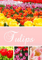
These images below are all actual book covers on tulips. Click on them to find them on Amazon.com/


There is a great article in the Huffington Post Books talking all about how we do judge a book by its cover. Read here: http://www.huffingtonpost.com/2013/05/30/book-cover-design-indies_n_3354504.html
If you have a picture book that you want to publish, find a local illustrator and get started.
There are many cover designers in NZ who can help you also, check out my links page on this blog.
Happy designing!
~ Joy Findlay
No comments:
Post a Comment